Translator Website Transformations: The Before and After - Part 2
Last week I shared with you two amazing website transformations from a couple of students in the first session of my T&I Website Blueprint Course. And because I could not choose just two to share, I'm here again this week to share one more!
Since the first session of this course in 2018, I've received several messages from other translators expressing interest in taking the course as well. Stay tuned to the end of this post to find out how to receive updates about when I will teach this course again (June 2019).
This website transformation is the work of Emily Safrin (Saffron Translations). Like Veronika, Emily already had a site to work with and wanted to give it a good refresh. As you’re about to see, Emily did just that. And, if you don't mind my saying so… her site is drool-worthy right from the first image!
Emily’s previous Home page looked like this...
The lines were clean, but like Molly, she didn't feel like her site had that extra oomph she wanted it to have.
Now, her Home page looks like this!
Emily plays off of her business name, Saffron Translations, by using a gorgeous image of saffron above the fold of her Home page. And her headline is perfect to let you know from the start that she is going to solve a problem for her clients so that they can do what they do best.
Emily's original About page was clean, and she immediately shared a head shot of herself so customers could put a face with a professional.
But she completely updated her About page copy with clear and value-based headlines that her ideal clients will appreciate.
She immediately follows with more reasons her ideal clients will want to work with her -- essentially, what sets her apart!
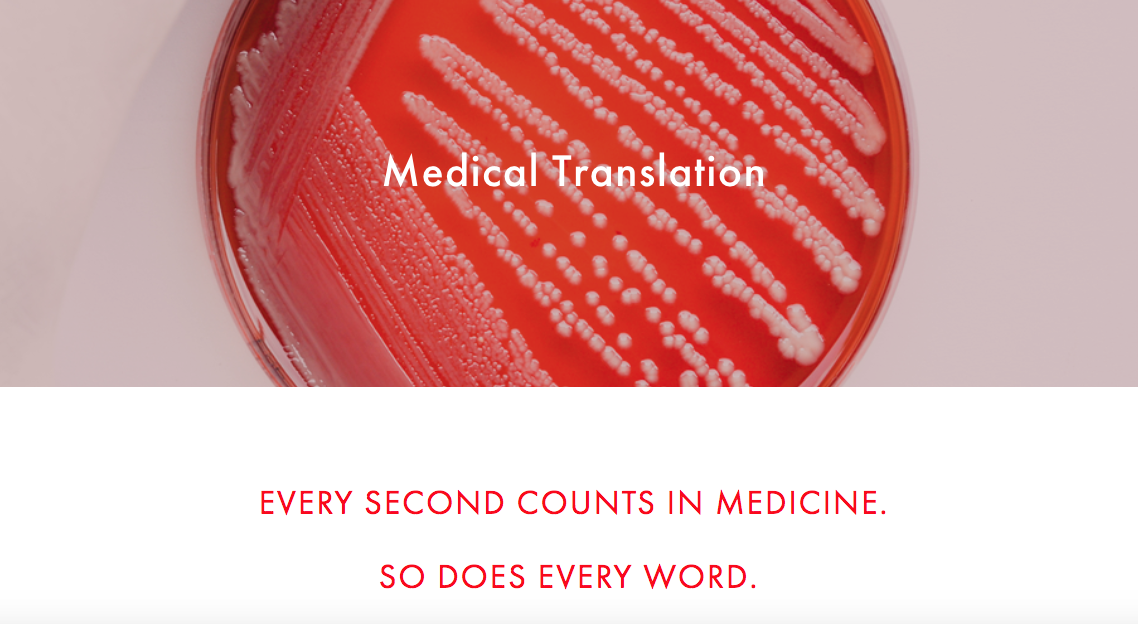
Emily's previous Services page was mostly text-based, including a small font that made the copy feel less appealing than the new layout she created in the course. She divided her Services up into two main pages: one for her medical and life sciences clients and one for her culinary clients. She chose images that appeal to those in each of her niche markets. And check out those headlines in the "After" images!
Before:
After:
Her Services pages go on to share more about the kind of work she handles, but instead of long paragraphs, Emily uses bulleted lists to make it easy for her customers to find the information they need. The example below is from her medical and life sciences Services page.
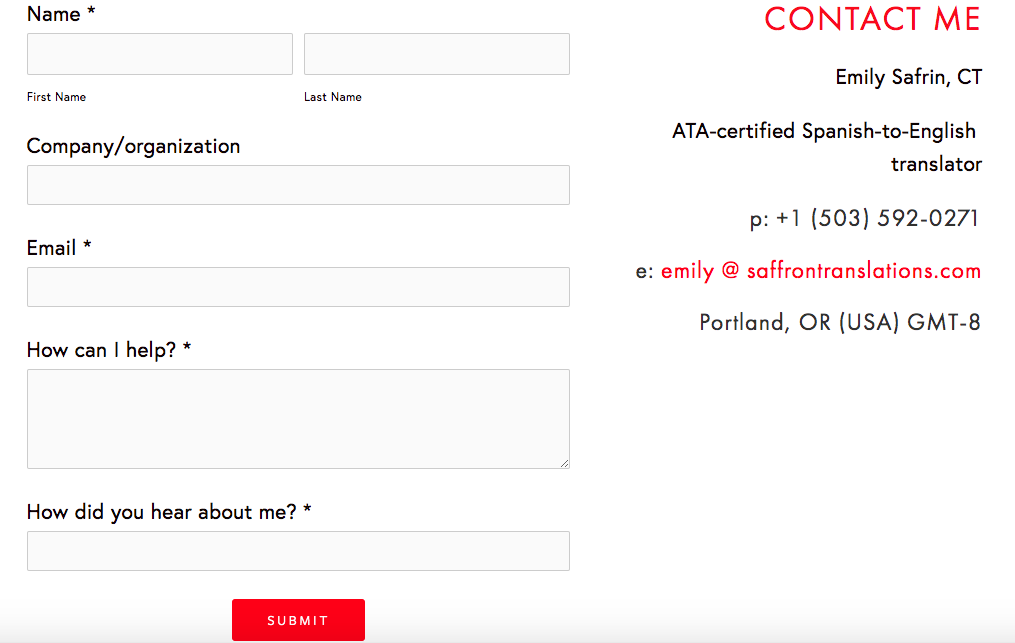
Finally, Emily took the time to create a more effective Contact page on her website. While her previous Contact page worked fine for most purposes...
Emily has already reaped the benefits of having updated her website!
I just on-boarded with a new agency client and when I went into their portal to fill out my profile, I noticed that the vendor manager had copy-pasted text from my "Bio and Publications" page into my profile so PMs can quickly see my strengths and background. She hadn't even mentioned that she looked at my website, but she clearly poked around enough to find that detail on my "Bio & Pubs" page and found it worthwhile to include in my profile! – Emily Safrin
Emily's new website is stunning. The images she chose are spot on with the types of clients she's looking to attract. Not only that, but Emily's experience brings up a point that all translators should consider. Whether you work for direct clients or translation agency project managers, your clients will look at your website to learn more about you and to get to know you better. Does your site reflect your best professional image?
If you, too, would like to update your website or create one from scratch, you can sign up to join the next session of the T&I Website Blueprint Course.
You can read Part 1 of the "before and after" website transformations that resulted from this course here.


